Graphic & UI Designer
Graphic & UI Designer

UI Design
Graphic Design
I hold a Bachelor of Arts in Studio Art with a concentration in Graphic Design, which provided me with a strong foundation in visual communication, design principles, and creative problem-solving. With over two years of professional experience in the design field, I have developed a versatile skill set that spans both traditional and digital media.I have proactively taught myself web development languages including HTML, CSS, and JavaScript. This self-driven learning has allowed me to integrate technical proficiency with my design work, enabling me to create functional, user-friendly websites and digital experiences.For UI and web design projects, I use Figma for creating high-fidelity mockups, wireframes, and interactive prototypes. I enjoy experimenting with design systems, typography, and color theory to ensure that each project is visually compelling and intuitive. Additionally, I am always learning new tools and technologies to stay up-to-date with industry trends and best practices.When I’m not designing or coding, I enjoy hiking and spending quality time with my cat, which helps me stay balanced and inspired. I believe that creativity flourishes when you make time for personal growth and relaxation outside of work.I am currently looking for a full time graphic design position. I’m excited to collaborate on new ventures where I can apply my design expertise and coding skills to create seamless user experiences.
Branding
UI Design
Graphic Design
Graphic & UI Designer
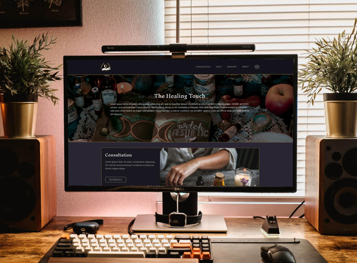
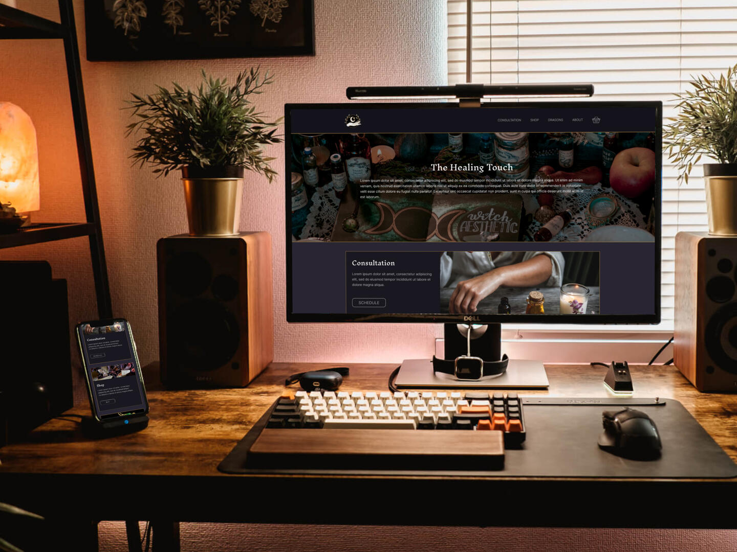
The Healing Touch
UI Design, Logo Design
Drawing inspiration from a novel, I designed a website for the fictional business The Healing Touch. A New Age shop offering a range of products, from candles and spices to unique dragon sculptures by local artists. In addition to its curated retail selection, the shop provides personalized consultations for customers seeking bespoke potions and remedies. This project showcases my ability to build a fully functional website from the ground up, tailored to the needs of a new business.
Branding
My first step was to create a mood board with an 'elegant yet dark' theme in mind. After testing various options, I settled on a color palette of deep plum accented with gold. Initially, I considered incorporating green, but found the contrast stronger and more fitting without it.Next, I designed a logo with simplicity in mind, ensuring it would be easy to reproduce and highly recognizable. I wanted the design to convey both healing and magic, so I chose a hand symbol to represent healing and stars to evoke a sense of the mystical. Although many early concepts included an eye, I decided against it in the final design to avoid any associations with a fortune-teller shop. I also incorporated plants to symbolize growth and to tie in with the natural ingredients the shop offers.


Desktop Wireframes
Given the broad age demographic of New Age customers, I opted for a traditional layout to ensure simplicity and ease of navigation. One challenge I faced during the design process was the lack of direct feedback regarding how the business operated—specifically, whether they sold products online or only in-store. To resolve this, I decided that items like the dragon sculptures would be available for purchase online, while the primary focus of the shop—consultations and tailored remedies—would be highlighted as an in-person service.
Desktop Mockups
I made several layout adjustments after reviewing the design. First, I reduced the size of the product images to create more viewing space and minimize scrolling. Next, I streamlined the filter button to achieve a sleeker, more modern look. Lastly, I simplified the footer by removing redundant menu options that were unnecessary for a smaller website.


Mobile Mockups
The mobile design follows a similar layout to the desktop version, with a greater emphasis on verticality. Navigation buttons transform into a hidden menu for a cleaner interface, the footer is simplified, and the product grid is adjusted for smaller screens. To maximize visibility, the product descriptions for the shop items and dragon sculptures were removed, allowing users to see more items at once.
Graphic & UI Designer
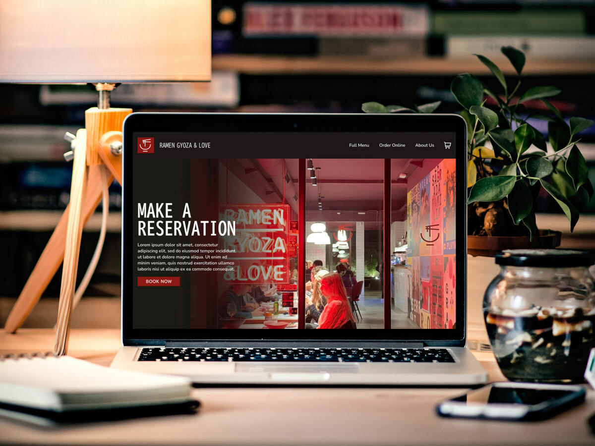
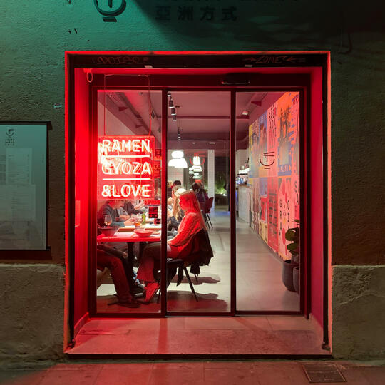
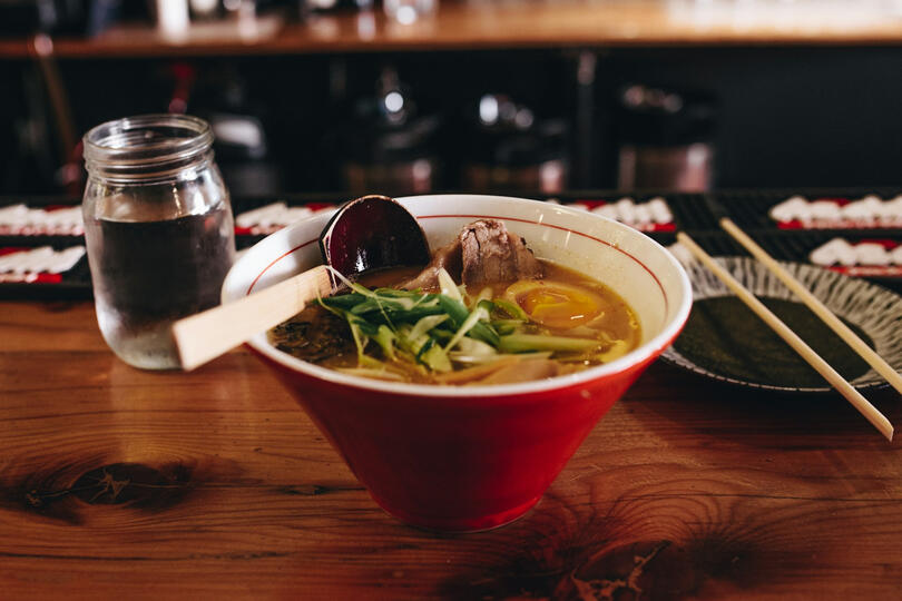
Ramen Gyoza & Love
UI Design
This project was created with the intention of designing a website for an established company that was undergoing a complete rebranding and renovation of its physical store. The website needed to not only showcase the company’s offerings but also provide a seamless user experience that matched the company’s updated identity, enhancing its digital presence while supporting its physical transformation.
Concept
I selected these images to represent a hypothetical restaurant company, using them as visual references. The process of sourcing these images is similar to gathering brand assets from a client; it helps me understand the mood and style of the brand. By working with these visuals, I can ensure the design captures the same atmosphere and experience a customer would have when visiting the restaurant.


Branding & Wireframes
The logo and company name were inspired by the references I gathered earlier. I added a square to the logo to give it a modern, clean look while ensuring it stood out on the website.Drawing inspiration from a neon sign, I chose red as the accent color. This not only contrasts nicely with the neutral tones but also serves to stimulate appetite, creating a dynamic visual appeal. Initially, I considered a brushstroke font for the logo but ultimately decided against it, as it felt overused and didn’t align with the modern aesthetic I was aiming for.The layout of the homepage was designed with the goal of engaging customers right away. The hero section is dedicated to showcasing any specials or key offerings from the restaurant. This is followed by a photo gallery featuring popular dishes to entice visitors, and finally, the shop’s information is placed for easy access to ordering and directions, ensuring a seamless user experience.